
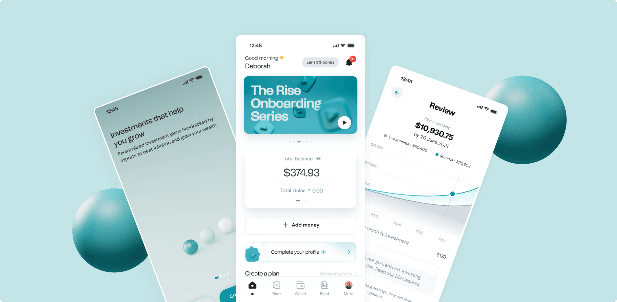
DRO Health is a digital health platform that makes healthcare more accessible by connecting users with medical professionals, diagnostic services, medications, and wellness programs , all from their smartphones. DRO Health empowers individuals to take control of their health by offering consultations with licensed doctors, ordering prescriptions, booking lab tests, and managing personal health records in one seamless experience.
DRO Health is a digital health platform that makes healthcare more accessible by connecting users with medical professionals, diagnostic services, medications, and wellness programs , all from their smartphones. DRO Health empowers individuals to take control of their health by offering consultations with licensed doctors, ordering prescriptions, booking lab tests, and managing personal health records in one seamless experience.
DRO Health is a digital health platform that makes healthcare more accessible by connecting users with medical professionals, diagnostic services, medications, and wellness programs , all from their smartphones. DRO Health empowers individuals to take control of their health by offering consultations with licensed doctors, ordering prescriptions, booking lab tests, and managing personal health records in one seamless experience.
Year
2022
2022
Industry
Health Tech, Telehealth
Health Tech, Telehealth
Scope of work
Research, UX Design, UI Design, Mobile
Research, UX Design, UI Design, Mobile

The Challenge
The Challenge
The Challenge
Despite its strong mission and growing user base, DRO Health’s platform was struggling to meet user expectations. Feedback from user interviews and app reviews highlighted several pain points:
Despite its strong mission and growing user base, DRO Health’s platform was struggling to meet user expectations. Feedback from user interviews and app reviews highlighted several pain points:
The user interface felt dated and cluttered, which made it hard to trust for sensitive healthcare needs.
Navigation was confusing, especially when switching between services like consultations, pharmacy, and lab tests.
High drop-offs during the sign-up process
Confusing navigation and fragmented information architecture.
Inconsistent visuals that didn’t reflect the brand’s credibility.
Key actions like booking a doctor or purchasing medication were not obvious.

Understanding the problem
Understanding the problem
Understanding the problem
Navigating the app was challenging for users, slowing down key tasks like account setup and appointment booking. To inform the redesign, we combined user interviews, surveys, analytics, and competitive benchmarking.
Navigating the app was challenging for users, slowing down key tasks like account setup and appointment booking. To inform the redesign, we combined user interviews, surveys, analytics, and competitive benchmarking.
01
Stressful Navigation
App layout was overwhelming, making essential actions hard to find
01
Stressful Navigation
App layout was overwhelming, making essential actions hard to find
02
High Drop-off
Account creation and booking flows had significant abandonment rates, highlighting friction points.
02
High Drop-off
Account creation and booking flows had significant abandonment rates, highlighting friction points.
03
Expectations vs. Reality
Users valued simplicity, speed, and trust, but existing flows didn’t consistently deliver these outcomes.
03
Expectations vs. Reality
Users valued simplicity, speed, and trust, but existing flows didn’t consistently deliver these outcomes.


Design Strategy & Execution
Design Strategy & Execution
Design Strategy & Execution
The approach prioritized usability, emotional trust, and behavioral guidance. The design focused on simplifying onboarding, clarifying navigation, and creating a consistent visual language to support faster access to care and improved user confidence. As a Senior Product Designer on this initiative, I was responsible for:
The approach prioritized usability, emotional trust, and behavioral guidance. The design focused on simplifying onboarding, clarifying navigation, and creating a consistent visual language to support faster access to care and improved user confidence. As a Senior Product Designer on this initiative, I was responsible for:
01
Redefined Key Flows
Simplified signup and appointment booking flows to reduce friction.
Mapped user journeys for “See a doctor,” “Order medication,” and “Book a test.”
Fewer steps and better guidance at each stage.
01
Redefined Key Flows
Simplified signup and appointment booking flows to reduce friction.
Mapped user journeys for “See a doctor,” “Order medication,” and “Book a test.”
Fewer steps and better guidance at each stage.
02
Navigation & Discovery Improvements
Reorganized homepage and menu for easier service discovery.
Consistent layouts and modular components for scalable future updates.
Reduced cognitive load through simplified hierarchy and spacing.
02
Navigation & Discovery Improvements
Reorganized homepage and menu for easier service discovery.
Consistent layouts and modular components for scalable future updates.
Reduced cognitive load through simplified hierarchy and spacing.
03
Cleaner, Trustworthy UI
Modernized interface with improved readability and accessibility.
Cohesive visual language reflects trust, care, and professionalism.
Highlighted key CTAs for faster user action.
03
Cleaner, Trustworthy UI
Modernized interface with improved readability and accessibility.
Cohesive visual language reflects trust, care, and professionalism.
Highlighted key CTAs for faster user action.


My Roles
My Roles
My Roles
I served as a Product Designer, leading the end-to-end redesign of the DRO Health app and website. I uncovered usability challenges through research, redefined information architecture, designed improved flows, wireframes, prototypes, and final UI in Figma, facilitated stakeholder reviews, and delivered a scalable UI system to engineering.
I served as a Product Designer, leading the end-to-end redesign of the DRO Health app and website. I uncovered usability challenges through research, redefined information architecture, designed improved flows, wireframes, prototypes, and final UI in Figma, facilitated stakeholder reviews, and delivered a scalable UI system to engineering.
Created a more intuitive and enjoyable user experience.
Created a more intuitive and enjoyable user experience.
Created a more intuitive and enjoyable user experience.
Reduced drop-offs during sign-up and appointment booking.
Reduced drop-offs during sign-up and appointment booking.
Reduced drop-offs during sign-up and appointment booking.
Received positive feedback from internal stakeholders and end-users.
Received positive feedback from internal stakeholders and end-users.
Received positive feedback from internal stakeholders and end-users.
Competitive benchmarking
Competitive benchmarking
Competitive benchmarking
Primary Goals
Primary Goals
Primary Goals
01
Reduce drop-off rates during sign-up and appointment booking
01
Reduce drop-off rates during sign-up and appointment booking
02
Simplify navigation and make key features more discoverable
02
Simplify navigation and make key features more discoverable
03
Build trust through a polished, modern, and accessible interface
03
Build trust through a polished, modern, and accessible interface
04
Create a scalable and consistent design system for future iterations
04
Create a scalable and consistent design system for future iterations
Impact
Impact
Impact
The redesign resulted in:
The redesign resulted in:
Sign-up & Booking Drop-off
Sign-up & Booking Drop-off
Satisfaction Rate
Satisfaction Rate
Satisfied Users
Satisfied Users
Research
Research
Research
Strategy
Strategy
Strategy
Redesign
Redesign
Redesign
Results
Results
Results
Before Redesign
Navigation was stressful and unintuitive
High drop-off during account creation and appointment booking
Key services were hard to discovery
Before Redesign
Navigation was stressful and unintuitive
High drop-off during account creation and appointment booking
Key services were hard to discovery
After Redesign
Streamlined signup and booking flows with fewer steps
Clear navigation and reorganized homepage for easy discovery
Modern, accessible UI increased user satisfaction and trust
After Redesign
Streamlined signup and booking flows with fewer steps
Clear navigation and reorganized homepage for easy discovery
Modern, accessible UI increased user satisfaction and trust
Credits
Credits
More Projects
More Projects
More Projects


Have a project in mind?
Have a project in mind?
Let’s talk
Let’s talk
Let’s talk
Tell me about the product you’re building and the problems you’re trying to solve
Tell me about the product you’re building and the problems you’re trying to solve

eat.
breathe.
design.

