
Lenox Park Solutions is a fintech company that empowers institutional investors and asset managers with data tools to promote collaboration, deal flow transparency, and diversity reporting. The platform supports investment workflows, portfolio tracking, and team collaboration through a unified digital interface.
Lenox Park Solutions is a fintech company that empowers institutional investors and asset managers with data tools to promote collaboration, deal flow transparency, and diversity reporting. The platform supports investment workflows, portfolio tracking, and team collaboration through a unified digital interface.
Lenox Park Solutions is a fintech company that empowers institutional investors and asset managers with data tools to promote collaboration, deal flow transparency, and diversity reporting. The platform supports investment workflows, portfolio tracking, and team collaboration through a unified digital interface.
Year
2024
2024
Industry
Fintech
Fintech
Scope of work
Research, UX Design, UI, Web Design
Research, UX Design, UI, Web Design

The Challenge
The Challenge
The Challenge
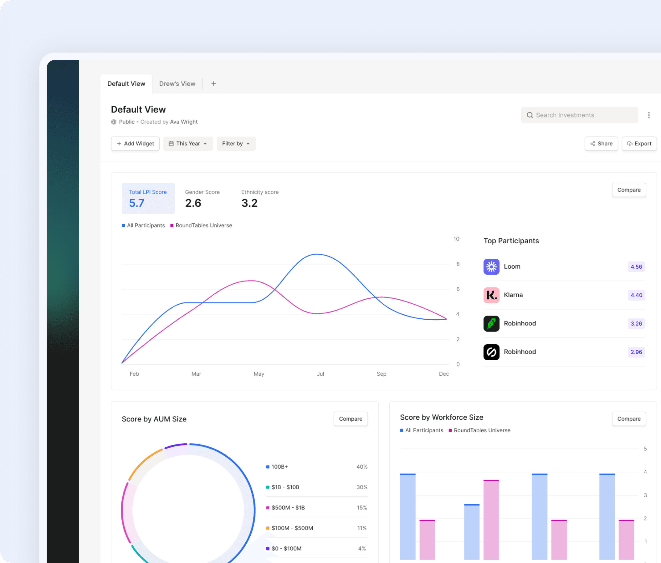
Lenox Park Solutions provides financial analytics tools for institutional investors. While the platform was powerful and data-rich, the interface became increasingly dense and complex as new features were added. Analysts needed faster access to insights, clearer data visualization, and more efficient workflows to support high-stakes decision-making. The challenge was to simplify complex financial data and workflows without sacrificing analytical depth or flexibility.
Lenox Park Solutions provides financial analytics tools for institutional investors. While the platform was powerful and data-rich, the interface became increasingly dense and complex as new features were added. Analysts needed faster access to insights, clearer data visualization, and more efficient workflows to support high-stakes decision-making. The challenge was to simplify complex financial data and workflows without sacrificing analytical depth or flexibility.
Dense Data Presentation: Too many metrics and charts surfaced at once, reducing insight clarity.
Inconsistent Layout Patterns: Layout and spacing inconsistencies reduced scanability and navigation flow.
Workflow Inefficiencies: Critical tasks required excessive steps, slowing time-to-insight.


Understanding the problem
Understanding the problem
Understanding the problem
Users didn’t struggle with financial data, they struggled with speed, clarity, and actionable insight. To ground the redesign in real analyst workflows and business context, I conducted interviews and observational research with investment analysts and managers, audited the existing platform, and benchmarked enterprise analytics tools. Here’s what we learned:
Users didn’t struggle with financial data, they struggled with speed, clarity, and actionable insight. To ground the redesign in real analyst workflows and business context, I conducted interviews and observational research with investment analysts and managers, audited the existing platform, and benchmarked enterprise analytics tools. Here’s what we learned:
01
Readability Breakdown
Dense data tables, weak grouping, and inconsistent layouts made complex financial data difficult to scan, interpret, and trust.
01
Readability Breakdown
Dense data tables, weak grouping, and inconsistent layouts made complex financial data difficult to scan, interpret, and trust.
02
Analytical Signal-to-Noise Problem
An overload of metrics surfaced simultaneously, making it difficult for analysts to isolate meaningful insights and trends.
02
Analytical Signal-to-Noise Problem
An overload of metrics surfaced simultaneously, making it difficult for analysts to isolate meaningful insights and trends.
03
Workflow Inefficiency
Core reporting and analysis tasks required unnecessary steps, increasing time-to-insight and reducing productivity.
03
Workflow Inefficiency
Core reporting and analysis tasks required unnecessary steps, increasing time-to-insight and reducing productivity.

Design Strategy & Execution
Design Strategy & Execution
Design Strategy & Execution
The strategy centered on simplifying complex financial data, improving information hierarchy, and streamlining analytical workflows. The goal was to reduce cognitive load, increase time-to-insight, and enable faster, more confident decision-making without sacrificing analytical power. As a Senior Product Designer on this initiative, I was responsible for:
The strategy centered on simplifying complex financial data, improving information hierarchy, and streamlining analytical workflows. The goal was to reduce cognitive load, increase time-to-insight, and enable faster, more confident decision-making without sacrificing analytical power. As a Senior Product Designer on this initiative, I was responsible for:
01
Unified, Actionable Dashboard
Redesigned dashboard as central hub for investments, tasks, and updates.
Decluttered interface to highlight priority information and reduce cognitive load.
Enabled quick actions from the dashboard for faster user decision-making.
01
Unified, Actionable Dashboard
Redesigned dashboard as central hub for investments, tasks, and updates.
Decluttered interface to highlight priority information and reduce cognitive load.
Enabled quick actions from the dashboard for faster user decision-making.
02
Streamlined Investment Management
Simplified table views for faster scanning and decision-making.
Visual cues (status indicators, scoring chips, role badges) for instant context.
Tabbed organization to separate personal, team, and group views.
02
Streamlined Investment Management
Simplified table views for faster scanning and decision-making.
Visual cues (status indicators, scoring chips, role badges) for instant context.
Tabbed organization to separate personal, team, and group views.
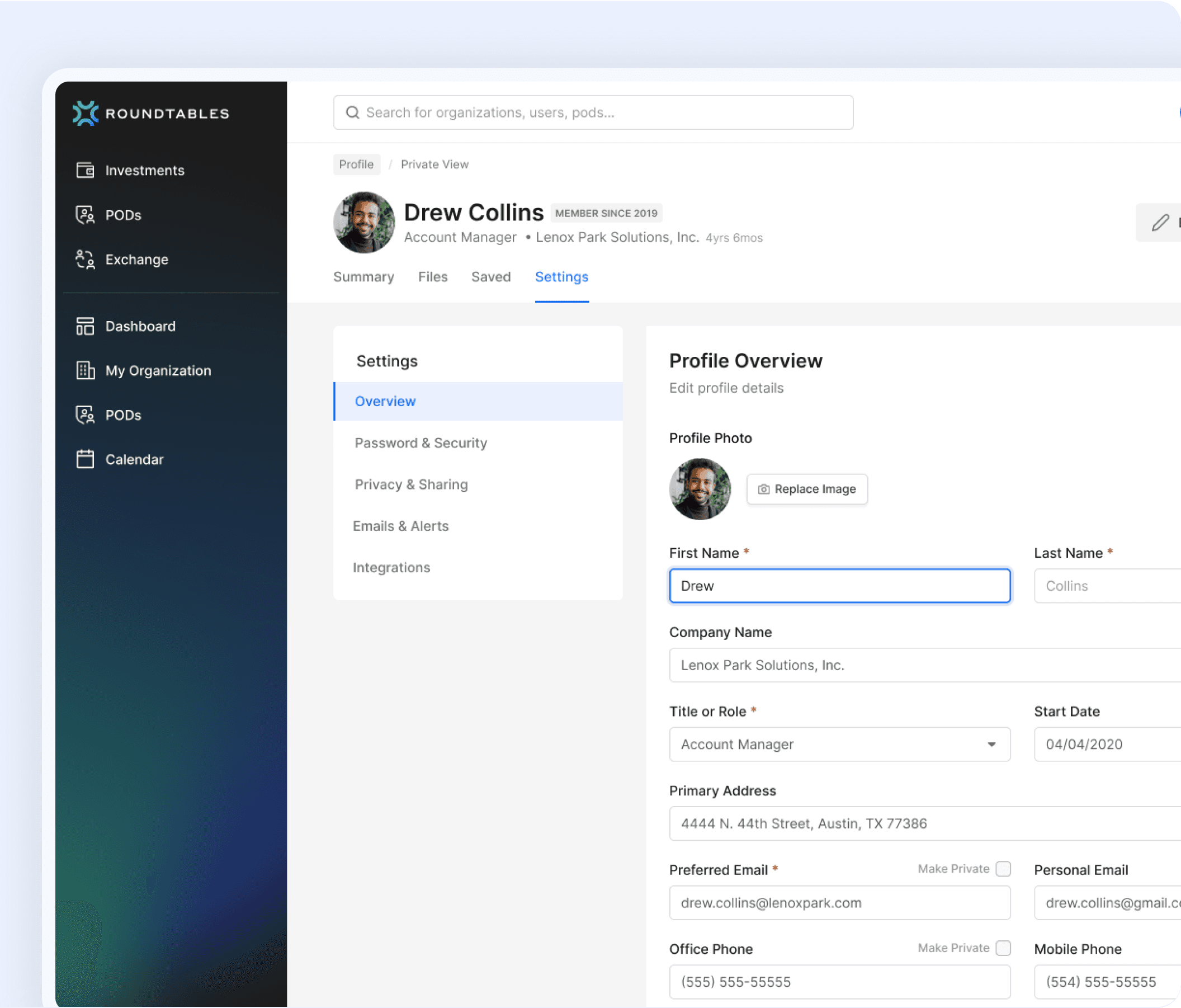
03
Consistent UI System
Aligned layout across list and detail views to reduce learning curve.
Established reusable UI elements to speed up feature development.
Created a visual language that scales without accumulating design debt.
03
Consistent UI System
Aligned layout across list and detail views to reduce learning curve.
Established reusable UI elements to speed up feature development.
Created a visual language that scales without accumulating design debt.


My Roles
My Roles
My Roles
I served as the Senior Product Designer, leading the redesign of the Lenox platform. I conducted research, mapped user flows, designed wireframes, prototypes, and final UI, collaborated with product and engineering teams, and validated designs through user testing.
I served as the Senior Product Designer, leading the redesign of the Lenox platform. I conducted research, mapped user flows, designed wireframes, prototypes, and final UI, collaborated with product and engineering teams, and validated designs through user testing.
Redesigned dashboard and investment flows for clarity.
Redesigned dashboard and investment flows for clarity.
Redesigned dashboard and investment flows for clarity.
Competitive benchmarking
Competitive benchmarking
Competitive benchmarking
Introduced unified, actionable dashboard
Introduced unified, actionable dashboard
Introduced unified, actionable dashboard
Built a scalable, consistent design system
Built a scalable, consistent design system
Built a scalable, consistent design system
Collaborated with stakeholders to align business and user needs.
Collaborated with stakeholders to align business and user needs.
Collaborated with stakeholders to align business and user needs.
Primary Goals
Primary Goals
Primary Goals
01
Simplify interface and layout for frictionless navigation.
01
Simplify interface and layout for frictionless navigation.
02
Create clear visual hierarchy for scannable data.
02
Create clear visual hierarchy for scannable data.
03
Integrate collaboration features seamlessly.
03
Integrate collaboration features seamlessly.
04
Ensure consistency and modern, professional look across devices.
04
Ensure consistency and modern, professional look across devices.


Impact
Impact
Impact
The redesign delivered strong outcomes across both user satisfaction and business performance:
The redesign delivered strong outcomes across both user satisfaction and business performance:
Task Completion Time
Task Completion Time
Dashboard engagement
Dashboard engagement
Customer Satisfaction
Customer Satisfaction
Research
Research
Research
Strategy
Strategy
Strategy
Redesign
Redesign
Redesign
Results
Results
Results
Before Redesign
Cluttered, overwhelming dashboard layout
Hard-to-scan investment data
Collaboration felt disjointed and secondary
Before Redesign
Cluttered, overwhelming dashboard layout
Hard-to-scan investment data
Collaboration felt disjointed and secondary
After Redesign
Simplified, scannable interface with clear visual hierarchy
Streamlined investment management for faster decisions
Integrated collaboration for seamless teamwork
After Redesign
Simplified, scannable interface with clear visual hierarchy
Streamlined investment management for faster decisions
Integrated collaboration for seamless teamwork
Credits
Credits
More Projects
More Projects
More Projects


Have a project in mind?
Have a project in mind?
Let’s talk
Let’s talk
Let’s talk
Tell me about the product you’re building and the problems you’re trying to solve
Tell me about the product you’re building and the problems you’re trying to solve

eat.
breathe.
design.

